包含标签 seaborn 的文章
Detailed Examples of Seaborn Plotting Kernel Density Curves
In a frequency distribution histogram, when the sample size is sufficiently enlarged to its limit, and the bin width is infinitely shortened, the step-like broken line in the frequency histogram will evolve into a smooth curve. This curve is called the density distribution curve of the population.
This article walks through how to use Seaborn with the Iris dataset in Pandas to plot several common kinds of kernel density curves.
1. Basic Density Curve
import seaborn as sns
import pandas as pd
sns.set(color_codes=True)
sns.set_style("white")
df = pd.read_csv('iris.csv')
sns.kdeplot(df['sepal_width'])

To plot a kernel density curve using Seaborn, you only need to use kdeplot. Note that a density curve only requires one variable; here we choose the sepal_width column.
2. Density Curve with Shading
import seaborn as sns
import pandas as pd
sns.set(color_codes=True)
sns.set_style("white")
df = pd.read_csv('iris.csv')
sns.kdeplot(df['sepal_width'], fill=True)

TypeError: ufunc 'isnan' not supported for the input types - Solution
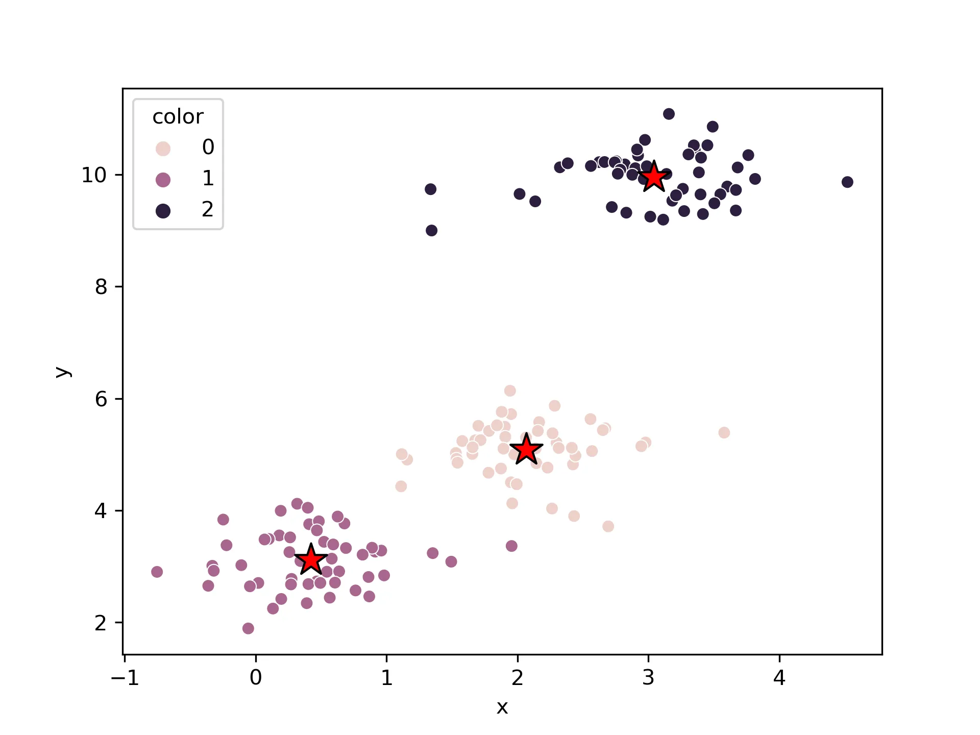
Today, while using Python’s Seaborn to plot a heatmap (clustermap), I kept encountering this error. My data seemed perfectly fine, and a Google search didn’t yield any good solutions. After some exploration, I’m sharing the final solution here.
Although the error appears inside Seaborn, the more common root cause is that the DataFrame being passed into plotting has become object dtype instead of a numeric dtype.
1. Generating the DataFrame
import pandas as pd
import numpy as np
import matplotlib.pyplot as plt
from seaborn import clustermap
import seaborn as sns; sns.set(color_codes=True)
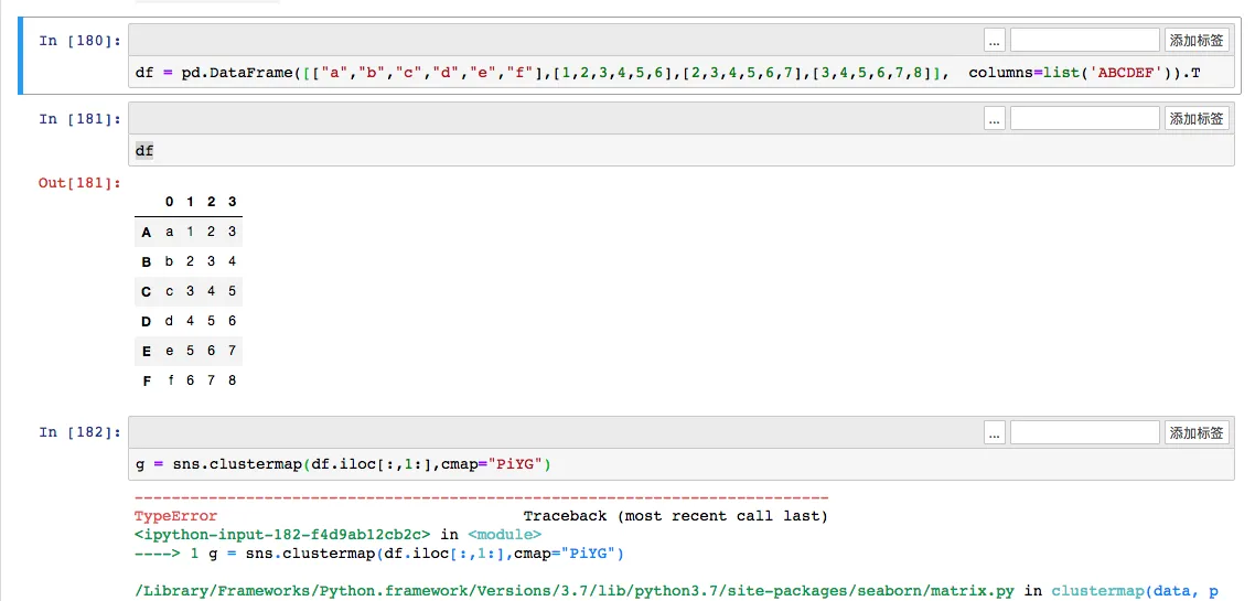
df = pd.DataFrame([["a","b","c","d","e","f"],[1,2,3,4,5,6],[2,3,4,5,6,7],[3,4,5,6,7,8]], columns=list('ABCDEF')).T
df
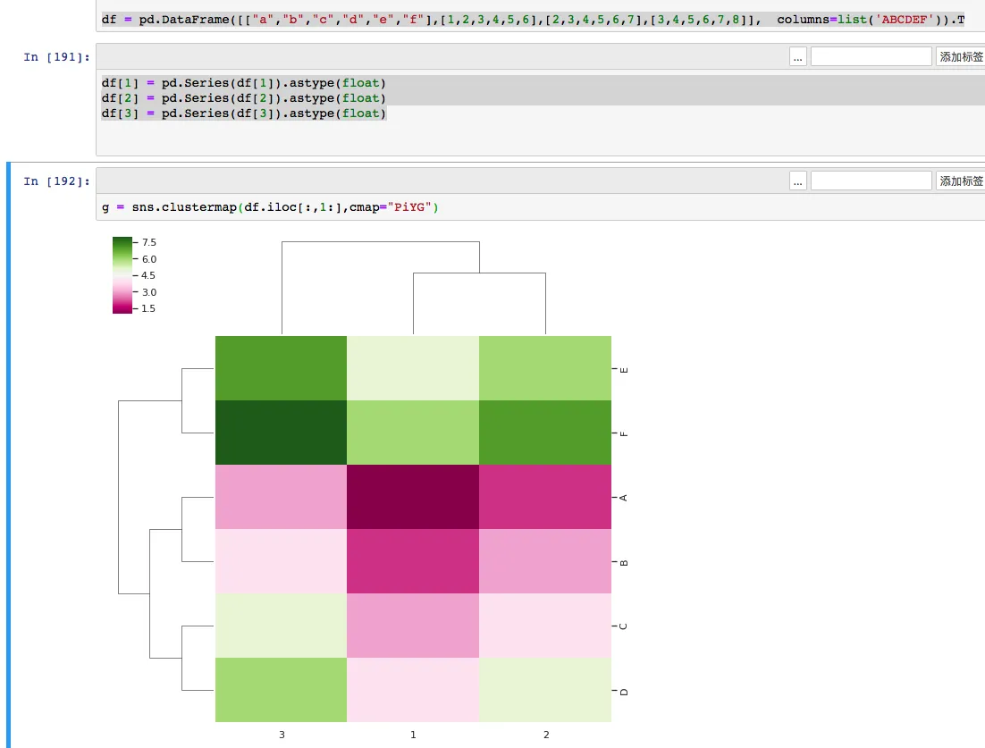
g = sns.clustermap(df.iloc[:,1:],cmap="PiYG")
After generating and transposing the DataFrame, a TypeError occurs: TypeError: ufunc 'isnan' not supported for the input types, and the inputs could not be safely coerced to any supported types according to the casting rule "safe".

Drawing Violin Plots with Seaborn
Introduction
A violin plot is used to display the distribution and probability density of multiple data groups. Similar to a box plot, it offers a better representation of data density. Violin plots are particularly useful when dealing with very large datasets that are difficult to display individually. Python’s Seaborn package makes it very convenient to create violin plots.
If you only need the median and quartiles, a box plot is often enough. If you also want to see whether the data looks skewed, wide, narrow, or even bimodal, a violin plot is usually more informative.
Parameters

The parameters corresponding to each position in a violin plot are shown above. The middle line represents the box plot data, specifically the 25th, 50th (median), and 75th percentiles. The thin lines indicate the 95% confidence interval.
Drawing Violin Plots with Seaborn
Single Variable Data
While a box plot would suffice for a single variable, a violin plot can certainly be used as well:
……最新文章
- Beginner Guide: Auto-build and Deploy a Hugo Site with GitHub Actions
- Codex Project Rules: Use AGENTS.md to Keep AI Coding Consistent
- Python Log Triage: Use rg and uv to Find Nginx 5xx Errors Fast
- Connect Codex to LiteLLM with Nginx as One Model Gateway
- Write Self-Contained Python Scripts with uv and PEP 723
- Build a Sky Flap Browser Game with Phaser: Source Download to Local Run
- Secure Python MCP Server: Add Boundaries to AI Tool Calls
- 2026 Practical Python Workflow: Replace pip, venv, and pipx with uv
- 2026 Practical Guide: Build Your First MCP Server with Python
- rg Tutorial: Why Many Developers Use ripgrep Instead of grep