Using Matplotlib's fill_between for Area Filling in Python
Area filling is a small plotting technique that often makes a figure much easier to read. With one extra layer of color, you can highlight trends, confidence ranges, threshold regions, or the distance between two curves. In Matplotlib, fill_between() is the standard tool for this job.
This article focuses on four practical uses:
- Fill below a baseline
- Fill up to a reference line
- Fill between two curves
- Highlight only the regions that satisfy a condition
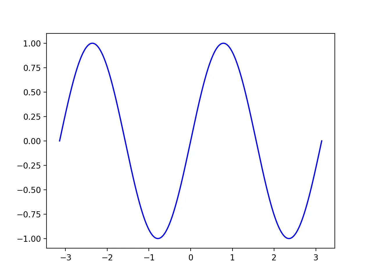
Data Preparation
First, let’s create a sine wave as our base data:
import numpy as np
import matplotlib.pyplot as plt

n = 1024
x = np.linspace(-np.pi, np.pi, n, endpoint=True)
y = np.sin(2 * x)

plt.plot(x, y, color='blue', alpha=1.00)
plt.savefig("sine_wave.png", dpi=200)
plt.close()
The resulting sine function plot is:
Matplotlib Fill Below
To fill with color using fill_between, set y2=0 so the curve fills down to the y=0 baseline.
plt.plot(x, y, color='blue', alpha=1.00)
plt.fill_between(x, y, 0, color='blue', alpha=.1)
plt.savefig("sin_fill_below.png",dpi=200)
plt.close()
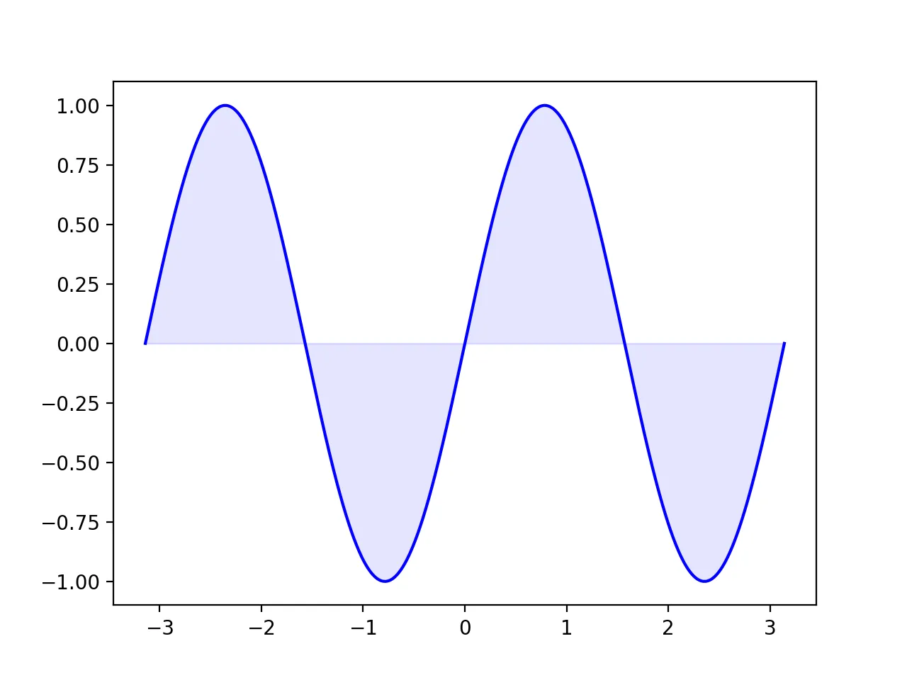 Key parameter explanations:
x: X-axis valuesy: Main curve values0: Fills down to y=0alpha: Controls transparency (0-1)
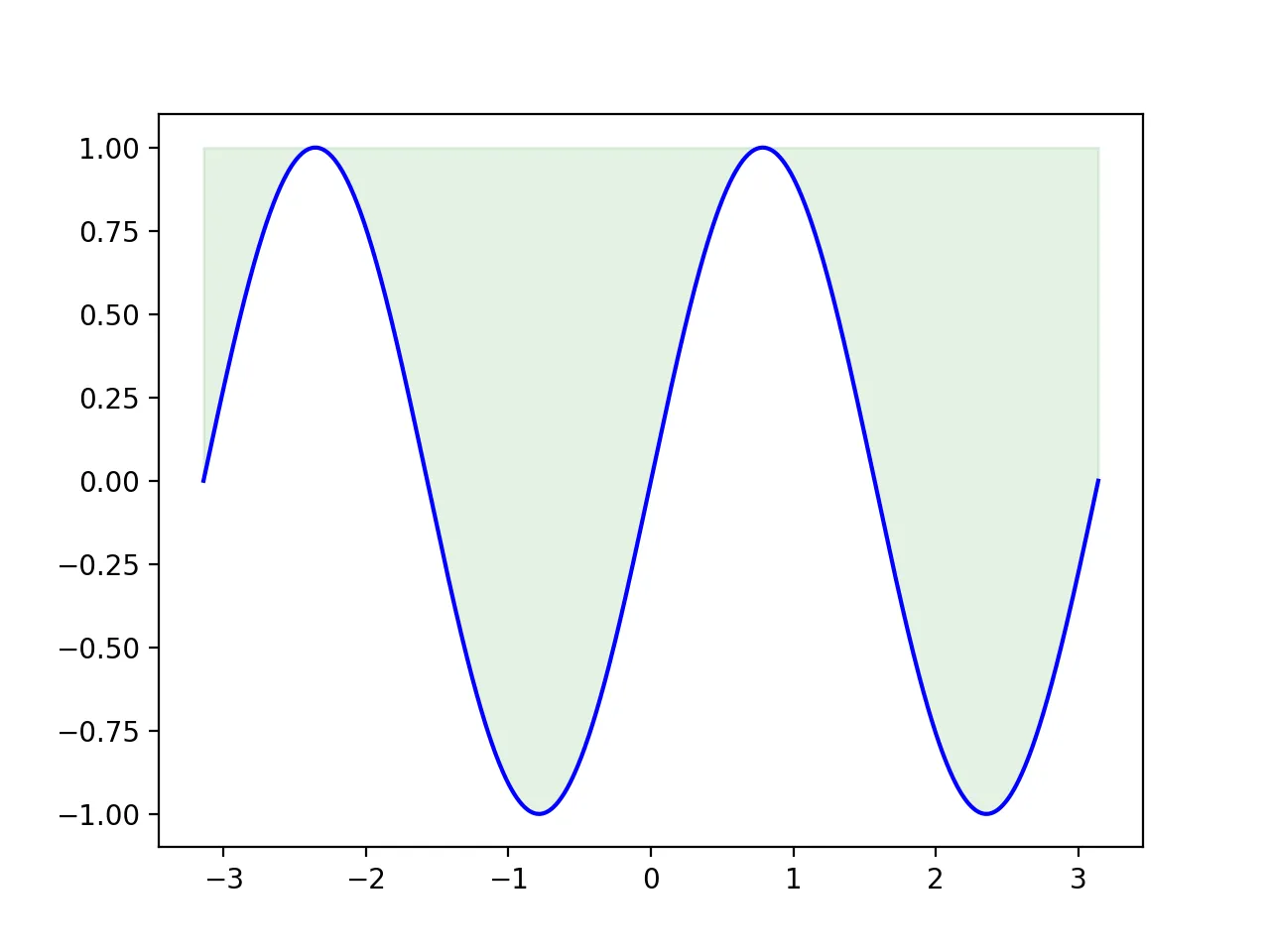
Matplotlib Fill Above
To fill upward, set y2=1 so the curve fills toward the y=1 reference line.
plt.plot(x, y, color='blue', alpha=1.00)
plt.fill_between(x, y, 1, color='green', alpha=.1)
plt.savefig("sin_fill_above.png",dpi=200)
plt.close()
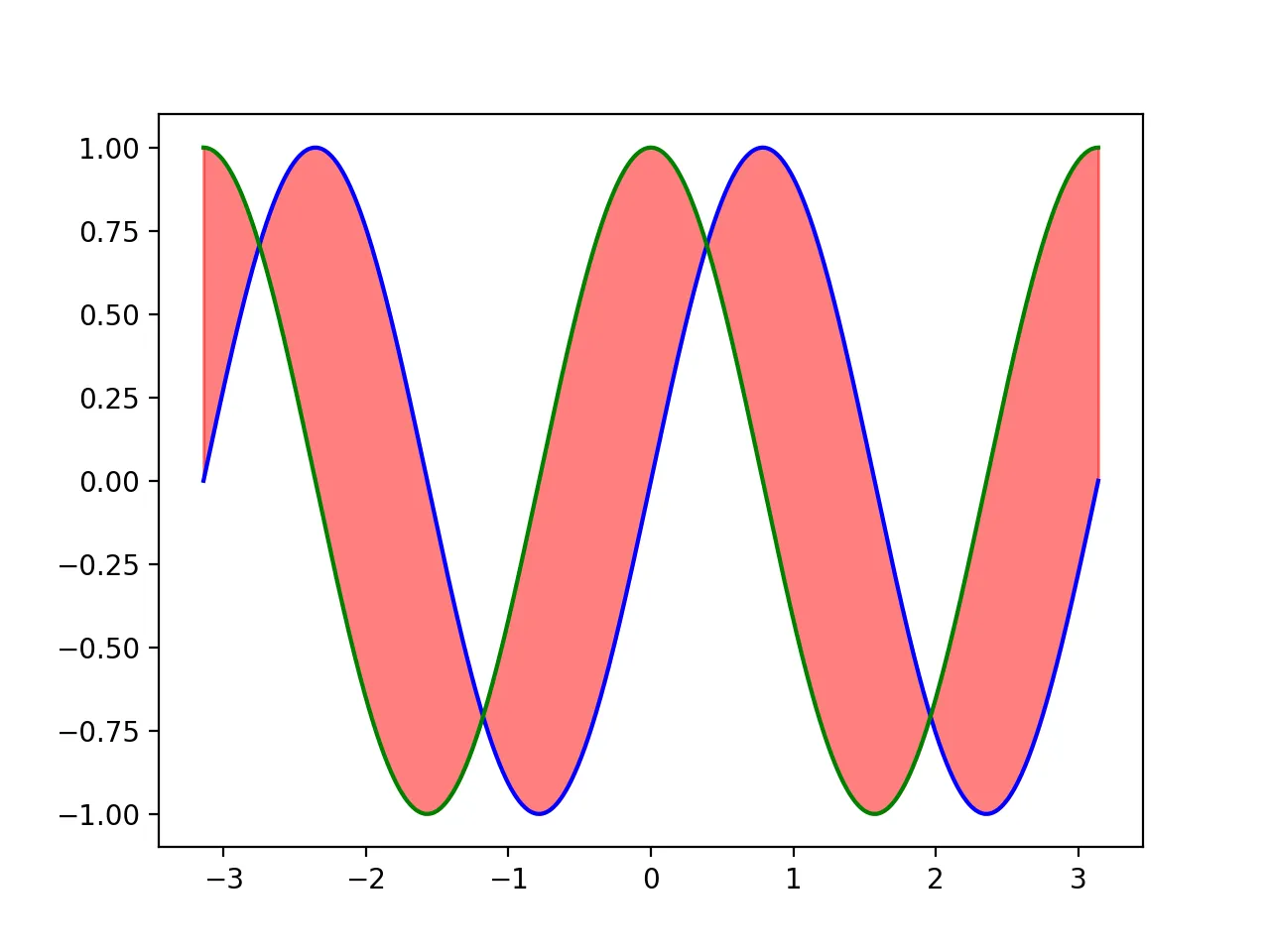
Matplotlib Fill Between Two Lines
Similarly, the difference lies in changing fill_between to the corresponding values for the lines. Here, we use cosine as the second line and fill the area between sine and cosine with red. The code is as follows:
import numpy as np
import pandas as pd
import matplotlib.pyplot as plt
import seaborn as sns
# Data Generation
n = 1024
x = np.linspace(-np.pi, np.pi, n, endpoint=True)
y = np.sin(2 * x)
y2 = np.cos(2*x)
# Plotting
plt.plot(x, y, color='blue', alpha=1.00)
plt.plot(x, y2, color='green', alpha=1.00)
plt.fill_between(x, y, y2, color='red', alpha=0.5)
plt.savefig("sin_cos_fill.png",dpi=200)
The resulting graph is:
Conditional area filling
In real work, you often do not want to color the entire region. Instead, you may want to highlight only the intervals above zero, below a threshold, or inside a target range. That is where the where parameter becomes useful:
plt.plot(x, y, color='blue')
plt.fill_between(x, y, 0, where=(y > 0), color='red', alpha=0.3)
plt.fill_between(x, y, 0, where=(y <= 0), color='green', alpha=0.3)
plt.savefig("sin_where_fill.png", dpi=200)
plt.close()
This pattern is especially useful for threshold highlighting, positive-vs-negative regions, and confidence-interval emphasis.
Practical Application Scenarios
The fill_between function is particularly suitable for:
- Highlighting confidence intervals
- Visualizing data ranges
- Comparing time series data
- Creating stacked area charts
Common issues
1. The filled color hides the main line
Most common cause: opacity is too high or the draw order is wrong.
Fix:
- Lower
alpha - Draw the fill first and the main line afterward
- Use a lighter fill color
2. Filling between two lines looks wrong
Most common cause: the two curves do not share the same x values, or there are missing values.
Fix:
- Make sure both curves use the same
x - Clean
NaNvalues first - Then call
fill_between(x, y1, y2)
3. The saved image is clipped
Fix:
- Keep
bbox_inches='tight' - Increase
dpi - Call
tight_layout()before saving
Related reading
Summary
Mastering Matplotlib’s fill_between() function can significantly enhance Python data visualization effects. Whether for scientific plotting, business dashboards, or exploratory data analysis, these techniques can make your charts more informative and visually appealing.
- 原文作者:春江暮客
- 原文链接:https://www.bobobk.com/en/748.html
- 版权声明:本作品采用 知识共享署名-非商业性使用-禁止演绎 4.0 国际许可协议 进行许可,非商业转载请注明出处(作者,原文链接),商业转载请联系作者获得授权。