Calculating the Gini Coefficient and Plotting the Lorenz Curve with matplotlib
The Gini coefficient and Lorenz curve are widely used to represent data inequality, especially wealth inequality. However, currently in Python, there isn’t a very good function to directly plot the Lorenz curve. Since the current project requires it, this article records how to use numpy, pandas, matplotlib, and other packages to calculate the Gini coefficient and plot the Lorenz curve for practical use. This will help everyone easily apply it when encountering similar problems.
This article mainly includes the following parts:
-
- Sample Data Acquisition
-
- Gini Coefficient Calculation
-
- Lorenz Curve Plotting
1. Sample Data Acquisition
You can use pd.read_csv to read existing CSV files containing tabular data, or use randomly generated data as shown in this article for validation. Here we use numpy’s built-in random function np.random.randint to get the data.
Code as follows:
#! env python

## Import necessary packages first
import numpy as np
import pandas as pd
from matplotlib import pyplot as plt

## Generate 1000 random data points
np.random.seed(1)  # Seed for reproducibility
data = np.random.randint(low=1, high=100, size=1000)  # Generate 1000 integers between 1 and 100
Using numpy’s randint method, we generate 1000 data points and save them into the data array. The seed is used to ensure everyone can reproduce the same results.
2. Gini Coefficient Calculation
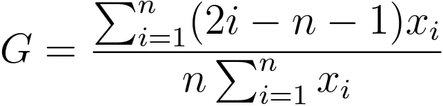
Suppose the group data is stored in data. How do we calculate the Gini coefficient? According to Wikipedia, the calculation method is:
Through transformation and simplification:
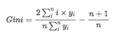
The right side becomes a constant, and the left side can be calculated directly using numpy. Here is the function to calculate the Gini coefficient:
def gini(arr):
    # Sort the array first
    arr = np.array(sorted(arr))

    n = len(arr)
    coef_ = 2. / n
    const_ = (n + 1.) / n
    weighted_sum = sum([(i + 1) * yi for i, yi in enumerate(arr)])
    return coef_ * weighted_sum / (arr.sum()) - const_

print(gini(data))

# Output: 0.3313838956962638
The result calculated is approximately 0.33.
Next is how to plot the Lorenz curve.
3. Lorenz Curve Plotting
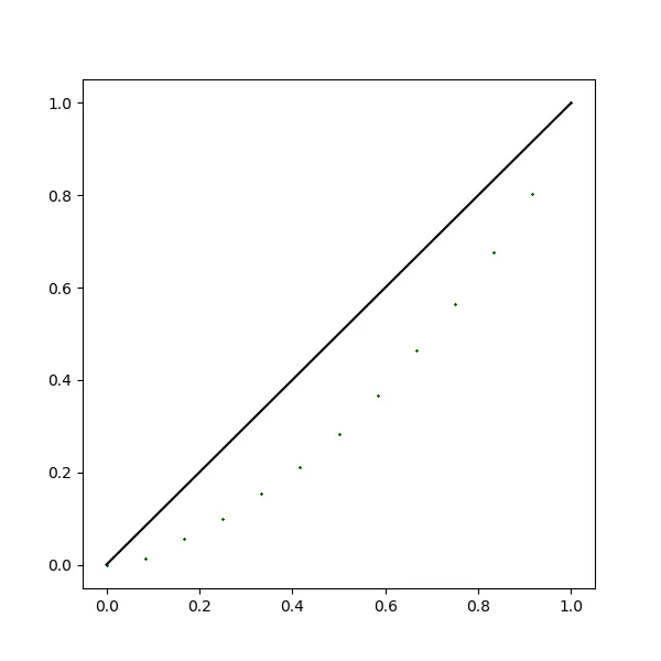
The Lorenz curve was originally used to represent income inequality. Each point on the curve represents the percentage of total wealth held by the corresponding percentage of the population. The famous 80-20 principle states that 80% of the people hold only 20% of the total wealth, while 20% of the people hold 80% of the wealth. Compared to the Gini coefficient, the Lorenz curve provides a more detailed representation, showing the wealth distribution at each percentile. In the Lorenz curve, the Gini coefficient corresponds to the area between the curve and the 45° line. To plot the Lorenz curve, we need to add (0,0) as the starting point of the curve.
Python code to plot the Lorenz curve:
def lorenz_curve(X):
    X = np.array(sorted(X))
    X_lorenz = X.cumsum() / X.sum()
    X_lorenz = np.insert(X_lorenz, 0, 0)
    x_axis = np.arange(X_lorenz.size) / (X_lorenz.size - 1)
    fig, ax = plt.subplots(figsize=[6, 6])
    ## Scatter plot
    ax.scatter(x_axis, X_lorenz,
               marker='x', color='darkgreen', s=1)
    ax.plot(x_axis, X_lorenz, color='darkgreen', linewidth=2)
    ax.plot([0, 1], [0, 1], color='k', linestyle='--')
    ax.set_title('Lorenz Curve')
    ax.set_xlabel('Cumulative share of population')
    ax.set_ylabel('Cumulative share of value')
    # Save the figure
    plt.savefig('lorenz_curve.png')


lorenz_curve(data)
Plot result:
Summary
This article introduced a way to represent data inequality using the Gini coefficient and the Lorenz curve. It implemented the calculation of the Gini coefficient in Python according to its definition, and plotted the Lorenz curve using matplotlib.
- 原文作者:春江暮客
- 原文链接:https://www.bobobk.com/en/521.html
- 版权声明:本作品采用 知识共享署名-非商业性使用-禁止演绎 4.0 国际许可协议 进行许可,非商业转载请注明出处(作者,原文链接),商业转载请联系作者获得授权。