Python: Creating Beautiful Lollipop Charts
If a bar chart feels too heavy and a plain scatter plot feels too weak, a lollipop chart is often a cleaner middle ground. It works especially well for scientific figures, category comparisons, or any dataset with a limited number of groups where you want the values to stay visually light but still easy to compare.
This article focuses on three practical questions:
- When a lollipop chart is a better choice than a bar chart
- How to build a clean version with matplotlib
- What to check before exporting the figure for papers, slides, or webpages
Introduction to Lollipop Charts
In a lollipop chart, each data point is represented by a “lollipop,” consisting of a line (the stick) and a dot (the candy) at the end of the line. The length of the line represents the magnitude of the value, while the dot highlights the specific data point. This format is especially suitable for comparing a limited number of categories or time points, making it an excellent choice for data visualization in fields such as biology, medicine, and environmental science.
The main advantage of lollipop charts lies in their ability to clearly convey information without confusing the audience. By focusing attention on individual data points, lollipop charts reduce visual clutter, making it easier for viewers to distinguish differences between categories. This is particularly useful when presenting complex datasets to a broad audience including researchers, practitioners, and policymakers.
Additionally, lollipop charts can be customized with color coding, annotations, and other graphical elements to enhance interpretability. For example, different colors can represent various experimental conditions, and annotations can provide context for specific data points. These features make lollipop charts a versatile tool for highlighting key findings and trends.
Python Code for Plotting
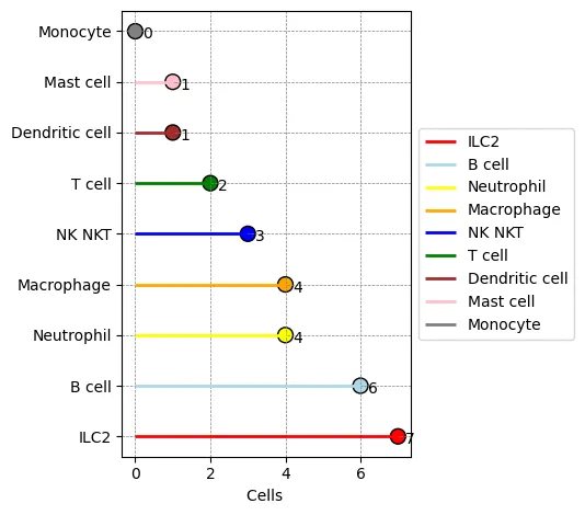
Let’s assume we have the following data set with cell types: ‘ILC2’, ‘B cell’, ‘Neutrophil’, ‘Macrophage’, ‘NK NKT’, ‘T cell’, ‘Dendritic cell’, ‘Mast cell’, ‘Monocyte’. The plot overlays line segments and scatter points. Here is the code:
import matplotlib.pyplot as plt

# Set data
cell_types = ['ILC2', 'B cell', 'Neutrophil', 'Macrophage', 'NK NKT', 'T cell', 'Dendritic cell', 'Mast cell', 'Monocyte']
shared_tissues = [7, 6, 4, 4, 3, 2, 1, 1, 0]
colors = ['red', 'lightblue', 'yellow', 'orange', 'blue', 'green', 'brown', 'pink', 'grey']

# Start plotting
fig, ax = plt.subplots()

# Draw horizontal lines
for i, (ct, st) in enumerate(zip(cell_types, shared_tissues)):
    ax.hlines(y=ct, xmin=0, xmax=st, color=colors[i], linewidth=2, label=ct)

# Scatter points
scatter = ax.scatter(shared_tissues, cell_types, s=100, c=colors, edgecolors='black')

# Add values
for i, txt in enumerate(shared_tissues):
    ax.annotate(txt, (shared_tissues[i], cell_types[i]), xytext=(5, -5), textcoords='offset points')

ax.set_xlabel('Cells ')
ax.set_ylabel('')
ax.grid(True, which='both', color='gray', linestyle='--', linewidth=0.5)
ax.legend(loc='center left', bbox_to_anchor=(1, 0.5))

plt.tight_layout(rect=[0, 0, 0.85, 1])
plt.savefig('lolipython.webp', bbox_inches='tight')
Result:

The most useful parts to customize
If you want to turn this into a production-ready figure, start with these:
- Add a
figsizeinplt.subplots()so labels do not get cramped - Adjust
s=100to control dot size and keep labels readable - Redesign
colorsif you have many categories or need a more publication-friendly palette - Simplify or remove the legend when it repeats information already shown on the axis
For category-heavy data, the horizontal form is usually easier to read than a vertical version, which is why this example uses hlines.
How to check whether the chart is readable
After plotting, review at least these points:
- Category labels are fully visible and not clipped
- Value annotations do not overlap with the dots
- The legend is actually helping instead of adding clutter
- The saved image still looks clear when scaled down in a paper or presentation
If you want a higher-quality export for reports or manuscripts, save a high-resolution version as well:
plt.savefig('lolipython.png', dpi=300, bbox_inches='tight')
Common issues
1. Too many labels make the plot messy
The usual fixes are:
- Switch to a horizontal layout
- Sort the categories by value before plotting
- Keep only the most important categories
2. Colors look too noisy
Scientific figures do not need a different bright color for every category.
Better options:
- Use shades from one color family
- Highlight only the key category or categories
- Keep the background and grid styling restrained
3. The saved figure gets clipped
This usually comes from tight layout and outside legends.
Fix:
- Keep
bbox_inches='tight' - Increase layout margins slightly
- Leave enough room on the right when the legend sits outside the plot
Related reading
Summary
Overall, the lollipop chart is a powerful and flexible visualization technique that effectively conveys scientific data, promotes better understanding, and supports informed decision-making in research and other fields.
In this article, we used the matplotlib library to generate a lollipop chart by overlaying lines and scatter points, achieving a visually pleasing scientific figure. Also, the new version of ChatGPT is really powerful; it can directly modify code you upload, which is super convenient.
- 原文作者:春江暮客
- 原文链接:https://www.bobobk.com/en/955.html
- 版权声明:本作品采用 知识共享署名-非商业性使用-禁止演绎 4.0 国际许可协议 进行许可,非商业转载请注明出处(作者,原文链接),商业转载请联系作者获得授权。