Drawing Raincloud Plots with Python
For exploratory analysis, box plots and violin plots are already useful, but a raincloud plot is often more expressive when you want both distribution shape and individual observations in one figure. By layering a violin, a boxplot, and scattered observations, it gives you a richer view without losing readability.
This article focuses on three practical questions:
- What layers make up a raincloud plot
- How to build those layers step by step in Python
- What to check before exporting the final figure
Introduction
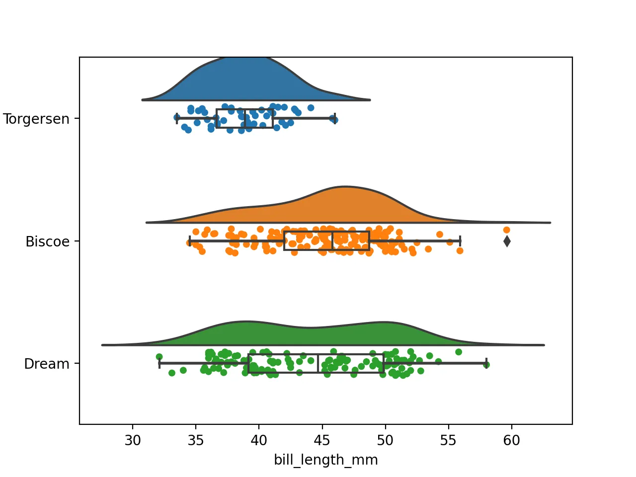
A raincloud plot is actually a hybrid plot consisting of four parts: a violin plot (the cloud), a boxplot (the umbrella), and a swarm plot (the rain).
Data Preparation
We’ll continue to use the penguin dataset as an example, which is already available on this site for direct download: Penguin Data
Download Data
pip install ptitprince
wget https://www.bobobk.com/wp-content/uploads/2021/12/penguins.csv
This penguin dataset is a good fit because it combines categorical groups with continuous measurements.
Load data
import pandas as pd
import matplotlib.pyplot as plt
import seaborn as sns
df = pd.read_csv("penguins.csv")
df.head()
Result
	species	island	bill_length_mm	bill_depth_mm	flipper_length_mm	body_mass_g	sex
0	Adelie	Torgersen	39.1	18.7	181.0	3750.0	MALE
1	Adelie	Torgersen	39.5	17.4	186.0	3800.0	FEMALE
2	Adelie	Torgersen	40.3	18.0	195.0	3250.0	FEMALE
3	Adelie	Torgersen	NaN	NaN	NaN	NaN	NaN
4	Adelie	Torgersen	36.7	19.3	193.0	3450.0	FEMALE
Starting the Plotting
We’ve already installed the ptitprince package using pip. Now, let’s start plotting.
Violin Plot
First, let’s create half of the violin plot, which is the “cloud” part of the raincloud plot. The data is for the bill_length_mm variable, grouped by island. The half_violinplot function creates half a violin plot, and inner controls the small lines below. To position the cloud correctly, we place the variable on the Y-axis.
import matplotlib.pyplot as plt
import ptitprince as pt
pt.half_violinplot(data=df,y="island",x="bill_length_mm",inner=None)
plt.savefig("half_violin.png",dpi=200)
Boxplot
Next is the “umbrella” part.
pt.half_violinplot(data=df,y="island",x="bill_length_mm",inner=None)
sns.boxplot(data=df,y="island",x="bill_length_mm",width = .15, zorder = 10,boxprops = {'facecolor':'none', "zorder":10},
            whiskerprops = {'linewidth':2, "zorder":10})
plt.savefig("violin_box.png",dpi=200)
Strip Plot
The “rain” part of the raincloud plot uses a stripplot, and the jitter parameter disperses the scattered points.
pt.half_violinplot(data=df,y="island",x="bill_length_mm",inner=None)
sns.boxplot(data=df,y="island",x="bill_length_mm",width = .15, zorder = 10,boxprops = {'facecolor':'none', "zorder":10},
            whiskerprops = {'linewidth':2, "zorder":10})
sns.stripplot(data=df,y="island",x="bill_length_mm",jitter=1,edgecolor = "white",zorder = 0)
plt.savefig("raincloud.png",dpi=200)
R Implementation
Here, I’m also providing the R language implementation of the raincloud plot.
library(ggplot2)
library(ggdist)
df = read.table("penguins.csv",sep=",",header=TRUE)
pdf("raincloud.pdf",width=14, height=7)
ggplot(data=df,aes(y=bill_length_mm,x=factor(island),fill=factor(island)))+
  ggdist::stat_halfeye(adjust=0.5,justification=-.2,.width=0,point_colour=NA) +
  geom_boxplot(width=0.2,outlier.color=NA) +
  ggdist::stat_dots(side="left",justification=1.1)
dev.off()
What to tune first in real usage
If you want to use the figure in a paper, slide deck, or article, adjust these first:
jitterto control how much the points spreadwidthin the boxplot so the middle layer does not hide too much of the violin- Violin smoothing parameters so the cloud does not become too wide or too sharp
- Color choices so the figure stays readable and publication-friendly
How to check whether the raincloud plot is readable
After plotting, verify at least these points:
- The layered components are still distinguishable
- Dense point regions do not become unreadable
- Category labels and axes are fully visible
- The exported image remains clear when scaled down
For formal output, save a higher-resolution version as well:
plt.savefig("raincloud.png", dpi=300, bbox_inches="tight")
Common issues
1. The layered chart looks too busy
Most common cause: too many visible points, strong colors, or a boxplot that is too wide.
Fix:
- Reduce
jitteror point size - Narrow the boxplot width
- Simplify the palette
2. The violin layer looks unnatural
Most common cause: smoothing is not appropriate for the sample size.
Fix:
- Adjust the smoothing parameters
- Be cautious with violin layers for very small groups
- If needed, keep only the boxplot and point layers
3. The saved image is not sharp enough
Fix:
- Increase
dpi - Keep
bbox_inches="tight" - Check the scaled-down version before final use
Related reading
Summary
This article demonstrates how to create a raincloud plot by combining violin plots, box plots, and stripplots. This type of plot is more intuitive and visually appealing for displaying data distributions.
- 原文作者:春江暮客
- 原文链接:https://www.bobobk.com/en/791.html
- 版权声明:本作品采用 知识共享署名-非商业性使用-禁止演绎 4.0 国际许可协议 进行许可,非商业转载请注明出处(作者,原文链接),商业转载请联系作者获得授权。