Faceswap Training Resource Acquisition and Processing

In a frequency distribution histogram, when the sample size is sufficiently enlarged to its limit, and the bin width is infinitely shortened, the step-like broken line in the frequency histogram will evolve into a smooth curve. This curve is called the density distribution curve of the population.
In this article, Chunjing Muke will detail how to use the Python plotting library Seaborn and the Iris flower dataset from Pandas to plot various cool density curves.
1. Basic Density Curve
    import seaborn as sns
    sns.set(color_codes=True)
    sns.set_style("white")
    df = pd.read_csv('iris.csv')
    sns.kdeplot(df['sepal_width'])
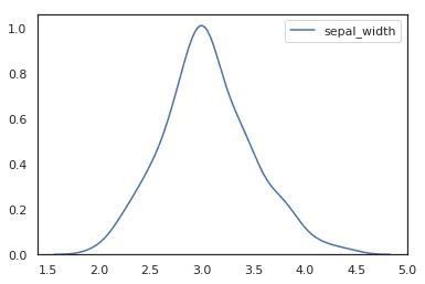
To plot a kernel density curve using Seaborn, you only need to use kdeplot. Note that a density curve only requires one variable; here we choose the sepal_width column.
2. Density Curve with Shading
    import seaborn as sns
    sns.set(color_codes=True)
    sns.set_style("white")
    df = pd.read_csv('iris.csv')
    sns.kdeplot(df['sepal_width'],shade=True)
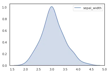
Simply specify shade=True when plotting with kdeplot.
3. Horizontal Density Curve
    import seaborn as sns
    sns.set(color_codes=True)
    sns.set_style("white")
    df = pd.read_csv('iris.csv')
    sns.kdeplot(df['sepal_width'],shade=True,vertical=True)
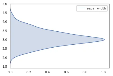
vertical specifies whether to make the density curve horizontal. Although the English meaning is “vertical”, which might be a bit confusing, the effect is indeed horizontal. ^-^
4. Bandwidth Adjustment
    import seaborn as sns
    sns.set(color_codes=True)
    sns.set_style("white")
    df = pd.read_csv('iris.csv')
    p1 = sns.kdeplot(df['sepal_width'], shade=True, bw=.5, color="red")
    p1 = sns.kdeplot(df['sepal_width'], shade=True, bw=.05, color="blue")
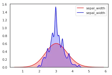
Different bandwidths result in different density curves for the same data. A smaller bandwidth will make the density curve less smooth.
5. Comparing Density Curves of Multiple Variables
    import seaborn as sns
    sns.set(color_codes=True)
    sns.set_style("white")
    df = pd.read_csv('iris.csv')
    p1=sns.kdeplot(df['sepal_width'], shade=True, color="red")
    p1=sns.kdeplot(df['sepal_length'], shade=True, color="blue")
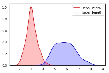
For multiple variables, we simply plot two density maps together.
6. Density Curve for Two Variables (Scatter Density)
    import seaborn as sns
    sns.set(color_codes=True)
    sns.set_style("white")
    df = pd.read_csv('iris.csv')
    sns.kdeplot(df['sepal_width'],df['sepal_length'], shade=True, color="red")
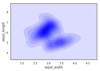
It’s important to note that this cool map-like density curve is a different concept from the previous plot. One shows separate density curves for multiple variables, while this one is a density curve for two-dimensional data, where x and y appear as a combination.
Summary:
This article provides a detailed introduction to the kdeplot function, demonstrating how to use Python’s Seaborn package to create various distinct and visually appealing density plots. For more usage examples, please refer to the official documentation.
- 原文作者:春江暮客
- 原文链接:https://www.bobobk.com/en/271.html
- 版权声明:本作品采用 知识共享署名-非商业性使用-禁止演绎 4.0 国际许可协议 进行许可,非商业转载请注明出处(作者,原文链接),商业转载请联系作者获得授权。