Four Plotting Tips in Python

When visualizing data, it’s often necessary to plot multiple charts in a single figure. For example, if you want to visualize the same variable from different perspectives (e.g., side-by-side histograms and boxplots of numerical variables), multiple plots are useful. In this article, I share 4 simple but practical tips for plotting multiple charts.
Dataset 📦
Let’s import packages and update default settings to add some personal style to the charts. We’ll use Seaborn’s built-in dataset ’tips':
import seaborn as sns # v0.11.2
import matplotlib.pyplot as plt # v3.4.2
sns.set(style='darkgrid', context='talk', palette='rainbow')
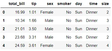
df = sns.load_dataset('tips')
df.head()
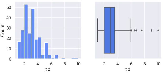
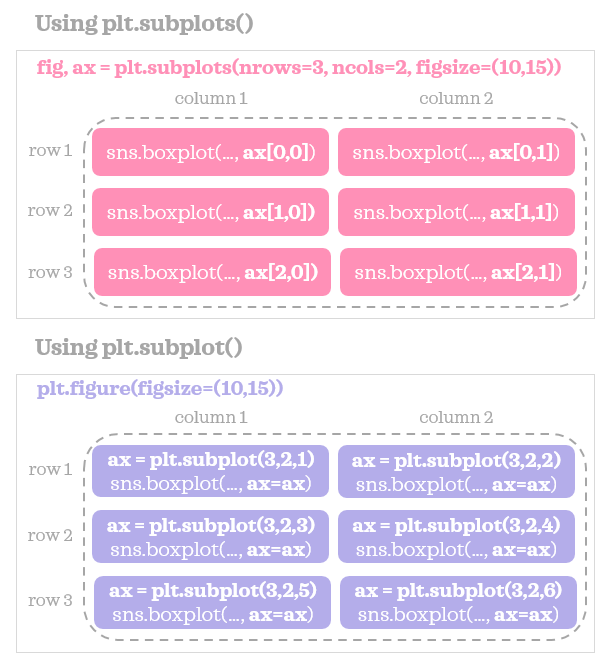
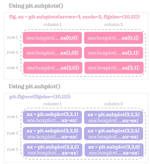
Tip 1: plt.subplots()
An easy way to plot multiple subplots is to use plt.subplots(). Here’s an example syntax for plotting 2 side-by-side subplots:
fig, ax = plt.subplots(nrows=1, ncols=2, figsize=(10,4))
sns.histplot(data=df, x='tip', ax=ax[0])
sns.boxplot(data=df, x='tip', ax=ax[1]);
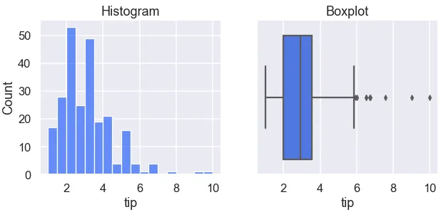
 You can further customize each subplot, for example by adding titles:
fig, ax = plt.subplots(1, 2, figsize=(10,4))
sns.histplot(data=df, x='tip', ax=ax[0])
ax[0].set_title("Histogram")
sns.boxplot(data=df, x='tip', ax=ax[1])
ax[1].set_title("Boxplot");
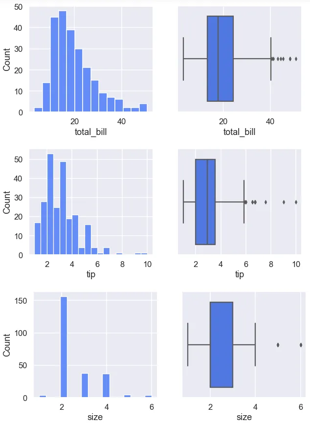
To plot the same pair of charts for all numerical variables in a loop:
numerical = df.select_dtypes('number').columns
for col in numerical:
    fig, ax = plt.subplots(1, 2, figsize=(10,4))
    sns.histplot(data=df, x=col, ax=ax[0])
    sns.boxplot(data=df, x=col, ax=ax[1]);
Tip 2: plt.subplot()
Another way to visualize multiple plots is using plt.subplot() (note: no “s” at the end). The syntax differs slightly:
plt.figure(figsize=(10,4))
ax1 = plt.subplot(1, 2, 1)
sns.histplot(data=df, x='tip', ax=ax1)
ax2 = plt.subplot(1, 2, 2)
sns.boxplot(data=df, x='tip', ax=ax2);
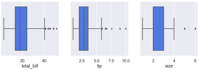
This method is especially useful when plotting the same type of chart for multiple variables side-by-side in a single figure:
plt.figure(figsize=(14,4))
for i, col in enumerate(numerical):
    ax = plt.subplot(1, len(numerical), i+1)
    sns.boxplot(data=df, x=col, ax=ax)
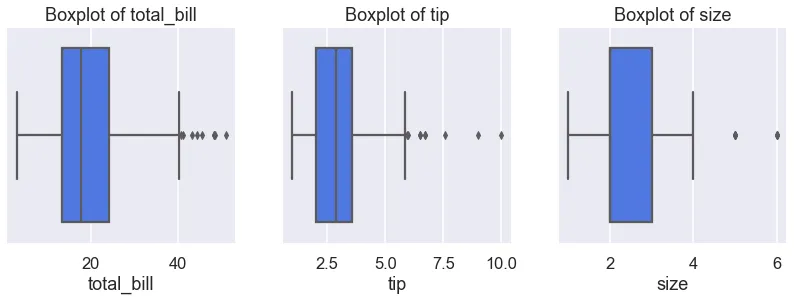
You can also add titles to each subplot:
plt.figure(figsize=(14,4))
for i, col in enumerate(numerical):
    ax = plt.subplot(1, len(numerical), i+1)
    sns.boxplot(data=df, x=col, ax=ax)
    ax.set_title(f"Boxplot of {col}")
Tip 3: plt.tight_layout()
When plotting multiple charts, labels sometimes overlap neighboring subplots, like this:
categorical = df.select_dtypes('category').columns
plt.figure(figsize=(8, 8))
for i, col in enumerate(categorical):
    ax = plt.subplot(2, 2, i+1)
    sns.countplot(data=df, x=col, ax=ax)
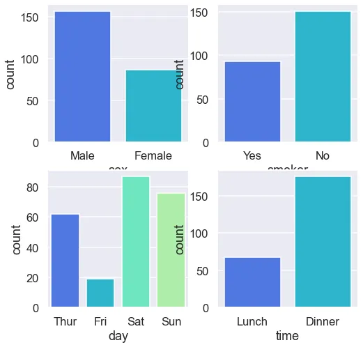
The x-axis labels of the top plots get cut off, and y-axis labels overlap. Using plt.tight_layout() fixes this nicely:
plt.figure(figsize=(8, 8))
for i, col in enumerate(categorical):
    ax = plt.subplot(2, 2, i+1)
    sns.countplot(data=df, x=col, ax=ax)
plt.tight_layout()
Tip 4: plt.suptitle()
Add an overall title to the whole figure:
plt.figure(figsize=(8, 8))
for i, col in enumerate(categorical):
    ax = plt.subplot(2, 2, i+1)
    sns.countplot(data=df, x=col, ax=ax)
plt.suptitle('Category counts for all categorical variables')
plt.tight_layout()
You can also customize individual subplots by adding titles, legends, or other features as needed.
- 原文作者:春江暮客
- 原文链接:https://www.bobobk.com/en/469843.html
- 版权声明:本作品采用 知识共享署名-非商业性使用-禁止演绎 4.0 国际许可协议 进行许可,非商业转载请注明出处(作者,原文链接),商业转载请联系作者获得授权。