Introduction to Canonical Correlation Analysis and Python Implementation
When you work with a single matrix, methods like PCA or LDA are often enough. But when you have two different feature sets measured on the same samples, the question changes from “how do I reduce each dataset?” to “what structure is shared most strongly across both datasets?”
That is where Canonical Correlation Analysis (CCA) becomes useful.
This article focuses on three practical questions:
- How CCA relates to PCA and how it differs
- How to run a simple CCA workflow in Python with sklearn
- How to judge whether the resulting canonical variables are worth interpreting
For additional theory background, see Wikipedia.
Relationship and Differences Between CCA and PCA
CCA is somewhat similar to PCA (Principal Component Analysis). Both were introduced by the same research group and can be thought of as dimensionality reduction techniques.
However:
- PCA aims to find linear combinations of variables within one dataset that explain the most variance.
- CCA aims to find linear combinations between two datasets that explain the maximum correlation.
Python Implementation of CCA
How do we implement CCA in Python?
The sklearn.cross_decomposition module provides the CCA function. Let’s take the penguins dataset as an example.
Preprocessing checks before running CCA
In real data, it is worth checking these first:
- The two matrices really come from the same samples in the same order
- Missing values are removed or imputed first
- Variables are standardized if their scales are very different
That is why the example below first uses dropna() and then applies StandardScaler().
import pandas as pd
import matplotlib.pyplot as plt
import seaborn as sns
import numpy as np
filename = "penguins.csv"
df = pd.read_csv(filename)
df = df.dropna()
df.head()
Sample data looks like:
species	island	bill_length_mm	bill_depth_mm	flipper_length_mm	body_mass_g	sex
0	Adelie	Torgersen	39.1	18.7	181.0	3750.0	MALE
1	Adelie	Torgersen	39.5	17.4	186.0	3800.0	FEMALE
2	Adelie	Torgersen	40.3	18.0	195.0	3250.0	FEMALE
4	Adelie	Torgersen	36.7	19.3	193.0	3450.0	FEMALE
5	Adelie	Torgersen	39.3	20.6	190.0	3650.0	MALE
We select two sets of features:
- Group 1:
bill_length_mm,bill_depth_mm - Group 2:
flipper_length_mm,body_mass_g
from sklearn.preprocessing import StandardScaler
df1 = df[["bill_length_mm","bill_depth_mm"]]
df1_std = pd.DataFrame(StandardScaler().fit(df1).transform(df1), columns = df1.columns)
df2 = df[["flipper_length_mm","body_mass_g"]]
df2_std = pd.DataFrame(StandardScaler().fit(df2).transform(df2), columns = df2.columns)
Sample output:
# df1_std
bill_length_mm	bill_depth_mm
-0.896042	    0.780732
-0.822788	    0.119584
-0.676280	    0.424729
-1.335566	    1.085877
-0.859415	    1.747026

# df2_std
flipper_length_mm	body_mass_g
-1.426752	        -0.568475
-1.069474	        -0.506286
-0.426373	        -1.190361
-0.569284	        -0.941606
-0.783651	        -0.692852
Now we perform CCA:
from sklearn.cross_decomposition import CCA
ca = CCA()
xc, yc = ca.fit(df1, df2).transform(df1, df2)
Check output shapes:
np.shape(xc)  # (333, 2)
np.shape(yc)  # (333, 2)
Check correlation:
np.corrcoef(xc[:, 0], yc[:, 0])
np.corrcoef(xc[:, 1], yc[:, 1])
Output:
array([[1.        , 0.78763151],
       [0.78763151, 1.        ]])
array([[1.        , 0.08638695],
       [0.08638695, 1.        ]])
Now combine CCA results with species and sex for visualization:
cca_res = pd.DataFrame({
    "CCA1_1": xc[:, 0],
    "CCA2_1": yc[:, 0],
    "CCA1_2": xc[:, 1],
    "CCA2_2": yc[:, 1],
    "Species": df.species,
    "sex": df.sex
})
cca_res.head()
CCA1_1	CCA2_1	CCA1_2	CCA2_2	Species	sex
-1.186252	-1.408795	-0.010367	0.682866	Adelie	MALE
-0.709573	-1.053857	-0.456036	0.429879	Adelie	FEMALE
-0.790732	-0.393550	-0.130809	-0.839620	Adelie	FEMALE
-1.718663	-0.542888	-0.073623	-0.458571	Adelie	FEMALE
-1.772295	-0.763548	0.736248	-0.014204	Adelie	MALE
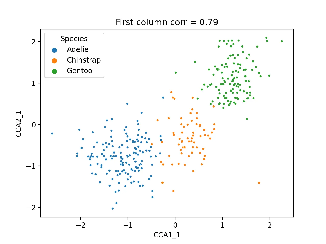
Scatter plot of first CCA component:
sns.scatterplot(data=cca_res, x="CCA1_1", y="CCA2_1", hue="Species", s=10)
plt.title(f'First column corr = {np.corrcoef(cca_res.CCA1_1, cca_res.CCA2_1)[0, 1]:.2f}')
plt.savefig("cca_first.png", dpi=200)
plt.close()
Heatmap of correlation between CCA results and original metadata:
cca_df = pd.DataFrame({
    "cca1_1": cca_res.CCA1_1,
    "cca1_2": cca_res.CCA1_2,
    "cca2_1": cca_res.CCA2_1,
    "cca2_2": cca_res.CCA2_2,
    "Species": df.species.astype('category').cat.codes,
    "Island": df.island.astype('category').cat.codes,
    "sex": df.sex.astype('category').cat.codes
})

dfcor = cca_df.corr()
mask = np.triu(np.ones_like(dfcor))
sns.heatmap(dfcor, cmap="bwr", annot=True)
plt.savefig("cca_corr.png", dpi=200)
plt.close()
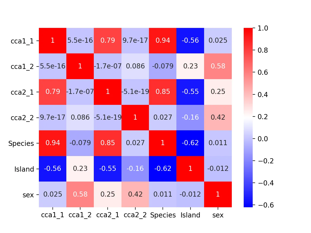
It turns out that the second pair of canonical variables correlates most with sex (correlation = 0.42), indicating it may encode sex information.
sns.scatterplot(data=cca_res, x="CCA1_2", y="CCA2_2", hue="sex", s=10)
plt.title(f'Second column corr = {np.corrcoef(cca_res.CCA1_2, cca_res.CCA2_2)[0, 1]:.2f}')
plt.savefig("cca_sex.png", dpi=200)
plt.close()
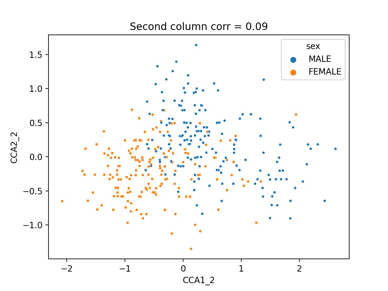
Different sexes are clearly separable.
How to decide whether a CCA result is worth interpreting
Not every canonical pair is equally informative. A practical sequence is:
- Check the correlation for each canonical pair
- Focus interpretation on the pairs with the strongest correlation
- Then connect those pairs back to the original variables or metadata
In this example, the first pair has correlation around 0.79 and is clearly worth attention. The second pair is much weaker, so it should not be interpreted with the same confidence.
Common issues
1. The canonical correlations are weak
Most common causes:
- The two variable sets are only weakly related
- The variables were not standardized first
- The selected features contain too much noise
2. There are fewer samples than variables
CCA can become unstable in that setting.
Safer options usually include:
- feature selection first
- PCA before CCA
- or a regularized CCA variant
3. The scatter plot looks separated, but the correlation is still low
That usually means the visual grouping may be driven by metadata structure rather than a strong shared continuous signal between the two datasets.
In that case, check the pairwise correlations, heatmap, and metadata associations together instead of relying on one scatter plot.
Related reading
Summary
CCA is an effective method for jointly analyzing multi-type datasets in high-dimensional spaces. It performs well on the penguin dataset and is a foundational tool in multi-omics analysis in biology. In future posts, we’ll explore more multi-omics integration methods.
- 原文作者:春江暮客
- 原文链接:https://www.bobobk.com/en/581.html
- 版权声明:本作品采用 知识共享署名-非商业性使用-禁止演绎 4.0 国际许可协议 进行许可,非商业转载请注明出处(作者,原文链接),商业转载请联系作者获得授权。
相关文章
- Hands-on Implementation of Random Forest Algorithm with Python
- Python Native Lists vs. NumPy Arrays
- Python3 Solution to LeetCode Medium Problem 468: Validate IP Address
- Calculating the Gini Coefficient and Plotting the Lorenz Curve with matplotlib
- Application of Python Implementation of Gradient Descent in Practice