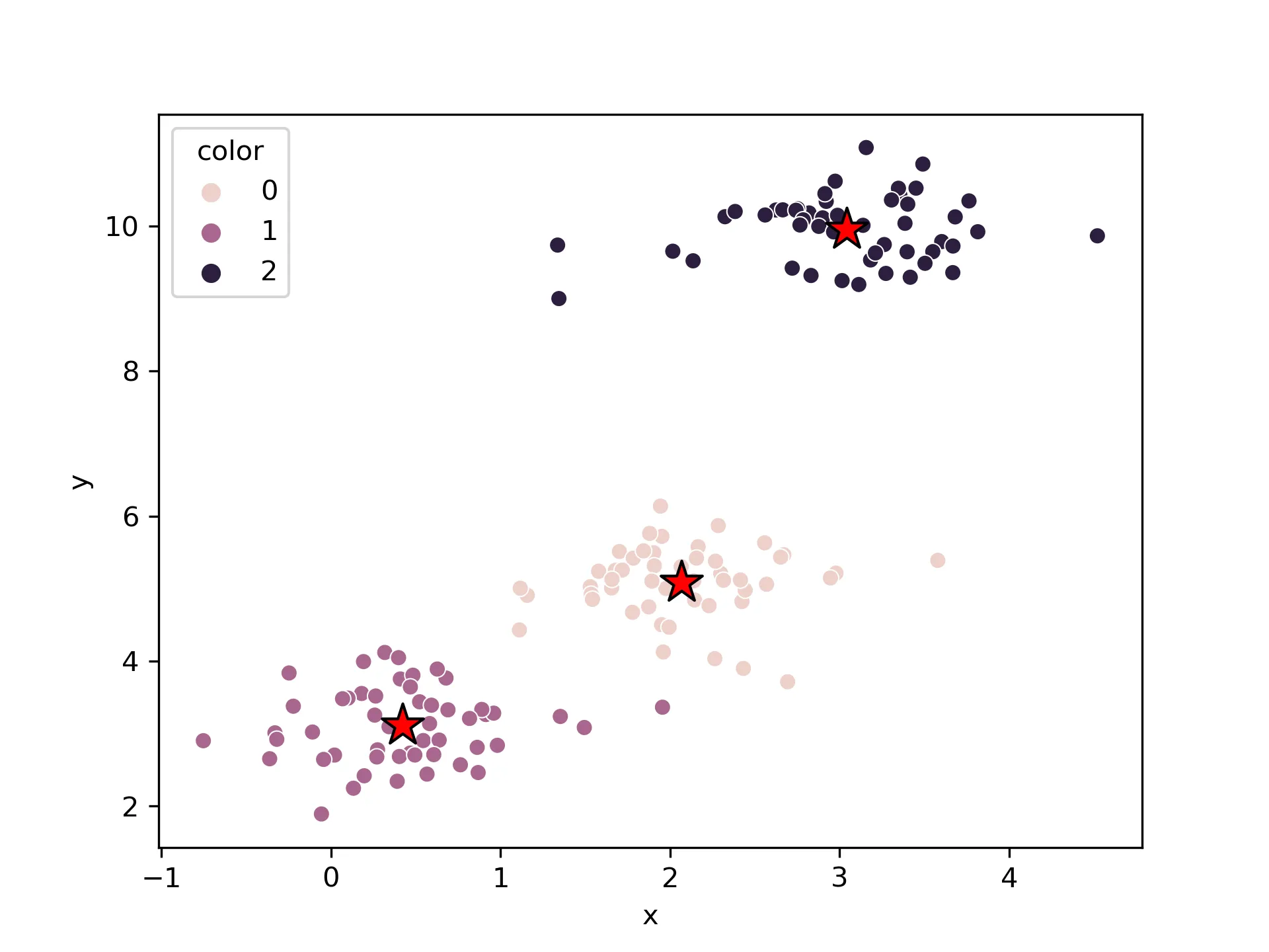
K-Means聚类及sklearn实现
聚类分析允许我们找到相似样本或者feature的组,这些对象之间的相关性更强。 常见的用途有包括按照不同的基因表达情况对样本进行分组,或者根据不同样本的分类对基因进行分组等……
春江暮客的个人学习分享网站
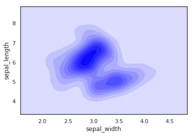
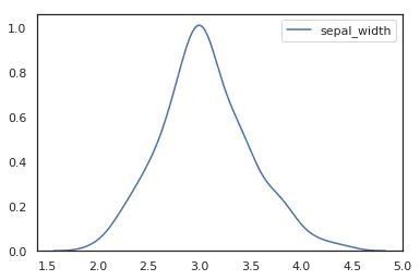
在频率分布直方图中,当样本容量充分放大到极限时,组距极限缩短,这个时候频率直方图中的阶梯折线就会演变成一条光滑的曲线,这条曲线就称为总体的密度分布曲线。
这篇文章将详细介绍如何使用 Python 绘图库 Seaborn 和 Pandas 里的 iris 鸢尾花数据集来绘制不同形式的核密度曲线。
    import seaborn as sns
    import pandas as pd
    sns.set(color_codes=True)
    sns.set_style("white")
    df = pd.read_csv('iris.csv')
    sns.kdeplot(df['sepal_width'])
使用seaborn画核密度曲线,只需要使用kdeplot就行,注意,密度曲线只需要一个变量就可以了,这里我们选用的是sepal_width这一列。
……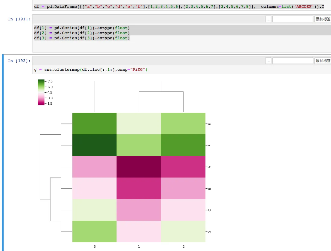
今天在使用python的seaborn画热图(clustermap)的时候,发现了总是出现这个错误,而且可以知道自己的数据完全是符合条件的,在搜索了谷歌后也没有找到好的解决方法,经过摸索后这里把最终解决方法告诉大家。
这类报错看起来像是 Seaborn 的问题,实际更常见的原因是传进去的 DataFrame 列类型已经变成了 object,而不是可用于数值计算的类型。
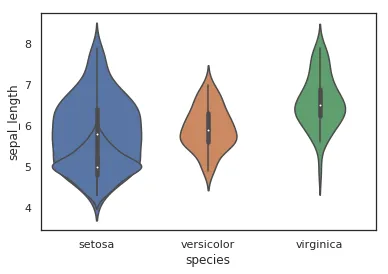
小提琴图是用来展示多组数据的分布状态以及概率密度。跟箱线图类似,但是可以密度层面展示更好。在数据量非常大不方便一个一个展示的时候小提琴图特别适用。而python里面的seaborn包可以很方便的画出小提琴图。
如果你只想看中位数、四分位数,箱线图通常就够了;如果你还想同时看出数据分布是否偏斜、是否有双峰趋势,小提琴图会更直观。
……