分类 Technology 中的文章
VPS Performance and Network One-Click Test Script
Using find and sed to Batch Replace Strings in Text
Manually Create Custom System Service on CentOS7
Solving Expert-Level Sudoku Puzzles Quickly Using Python's Backtracking Algorithm
Reducing /home partition size and increasing /root space in CentOS 8
Configuring IPv6 Passthrough for Padavan Router to Enable IPv6 for All Internal Hosts
Using requests and multiprocessing for multi-threaded brute-force cracking of default lnmp mysql password
Deploying an SSH Honeypot with Docker to Record SSH Login Passwords
10 Tips to Improve Your Python Data Analysis Skills
In programming, even small tips or tools can make a big difference.
For example, a shortcut key or a helpful package might simplify a lot of work and double your efficiency.
Here I’ll share a few small tricks I often use.
1. Use pandas_profiling
to Inspect DataFrames
Understanding your data is essential before doing any analysis.
Although df.describe()
and df.info()
provide basic summaries, they’re limited with large or complex datasets.
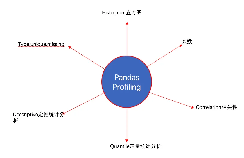
The pandas_profiling
library offers detailed profiling through profile_report()
.
Installation
pip install pandas-profiling
# or
conda install -c anaconda pandas-profiling
Usage
It’s very easy to use:
import pandas as pd
import pandas_profiling
df = pd.read_csv("train.csv")
df.profile_report()
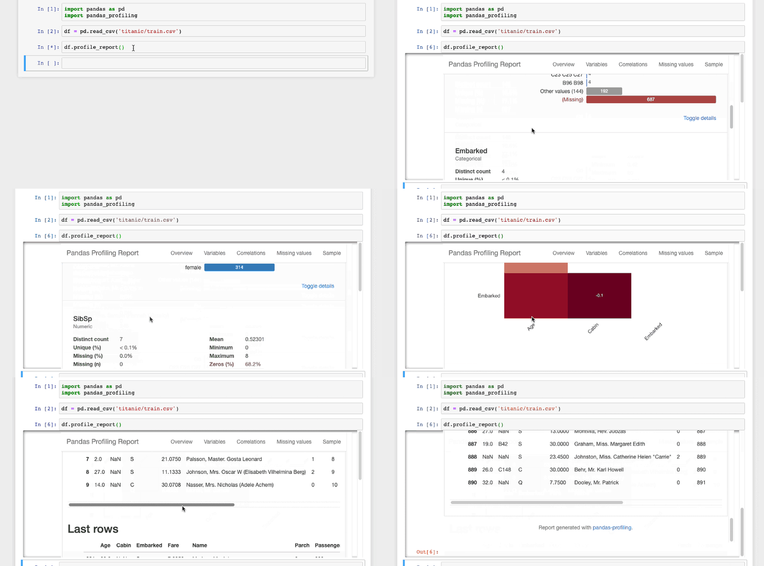
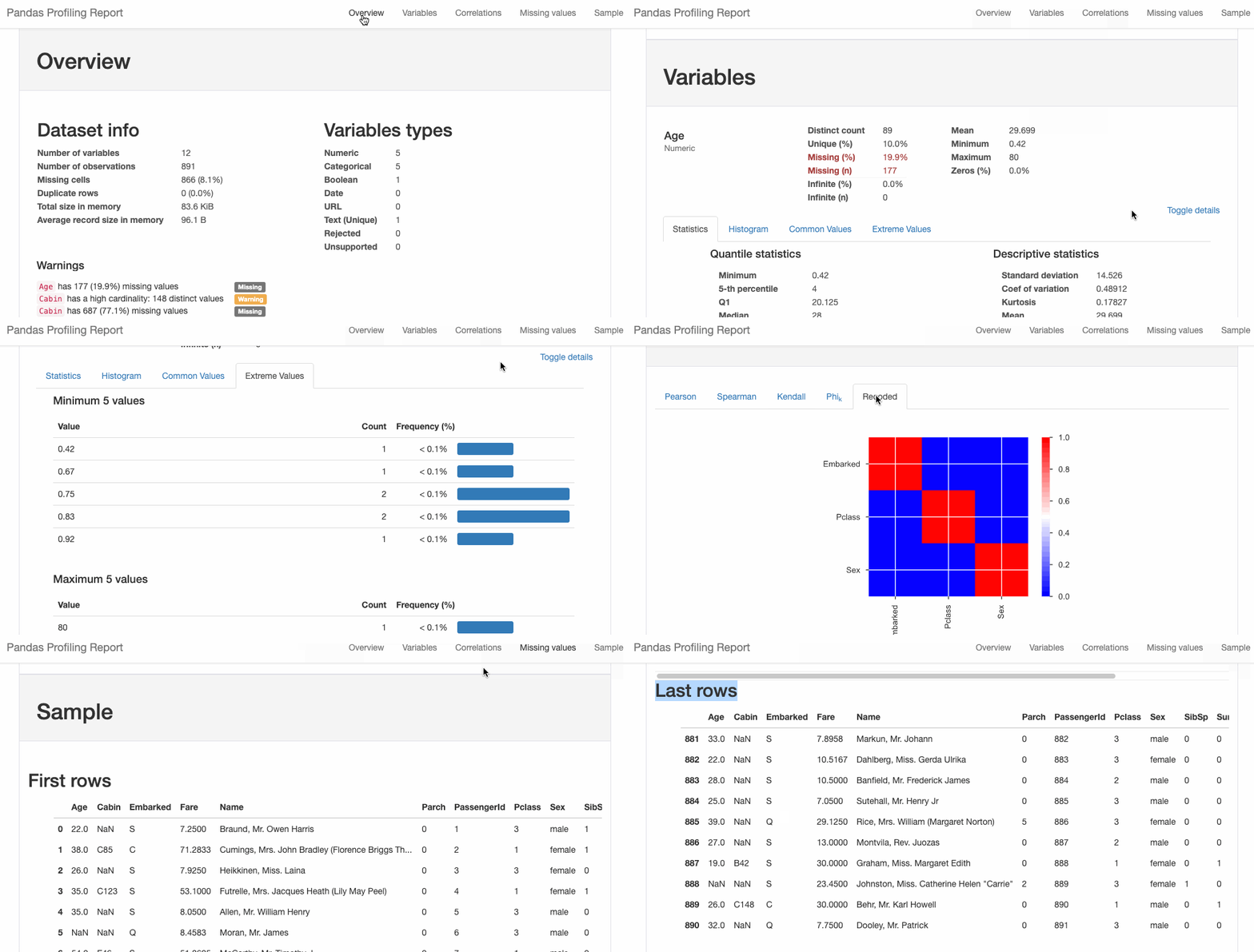
You can also export the report to HTML:
html = df.profile_report(title='Titanic Profiling Report')
html.to_file(outputfile="titanic_Profiling_Report.html")
2. Interactive Plotting with cufflinks
Pandas has built-in plotting via .plot()
, but it’s not interactive.
If you want interactivity, try the cufflinks
package.
Serialization and Deserialization in Python
Python Data Visualization - The Post-2000 Gaokao Generation
The post-2000 generation has finished their Gaokao (National College Entrance Examination), and there’s been extensive media coverage (they are the “fresh meat” generation, after all!). Many reports focused on this year’s examinee data, presenting it with stunning charts. Feeling a bit jealous about how beautiful those charts are? Do you want to try making one yourself? These charts are actually products of data visualization created with Python, so yes, you can definitely make them yourself!
Preparation
-
Libraries
charts
pyecharts
-
Data
- Collected directly from Baidu.
Common Chart Types
Bar charts and line charts are frequently seen and used, so let’s start with the basics.
1. Bar Chart
# Number of Gaokao examinees
gaokao_num = [940,940,...,375]
gaokao_num.reverse()
# Number of admitted students
luqu_num = [700,705,...,221]
luqu_num.reverse()
# Admission rate
luqu_lev= [74.46,75,...,59]
luqu_lev.reverse()
import charts
options = {
'chart' : {'zoomType':'xy'},
# Title
'title' : {'text': '2000-2017 Gaokao Data'},
# Subtitle
'subtitle': {'text': 'Source: edu.sina.com.cn'},
# X-axis
'xAxis' : {'categories': ['2000',...,'2017']},
# Y-axis
'yAxis' : {'title': {'text': 'Million people/year'}},
}
series = [{
'type': 'column',
'name': 'Number of Gaokao Examinees',
'data': gaokao_num
},{
'type': 'column',
'name': 'Number of Admitted Students',
'data': luqu_num
}
]
charts.plot(series, options=options, show='inline')
Due to a minor issue with my pyecharts
setup, I used the charts
library. Using pyecharts
is even simpler, but I won’t repeat it here. You can check the source code if needed.