分类 Tech 中的文章

Automatically Publishing Articles to WordPress Using a Python Script: A Complete Workflow Analysis

When building content sites or AI content distribution projects, how can you efficiently batch publish generated content to WordPress? This article will share how I used a Python script to build an automated content publishing process that does not rely on the WordPress backend, does not require XML import, and directly connects to the database for maximum efficiency.……

阅读全文

Solving Expert-Level Sudoku Puzzles Quickly Using Python's Backtracking Algorithm

I often play Sudoku in my leisure time as a form of relaxation. My usual method involves eliminating duplicates and filling in unique numbers first, then proceeding step by step. However, it’s inevitable to guess numbers and adjust based on feedback. So, is there a better algorithm to solve Sudoku puzzles? Here, I will use the backtracking method in Python to solve 9x9 expert-level Sudoku puzzles.……

阅读全文

10 Tips to Improve Your Python Data Analysis Skills

In programming, even small tips or tools can make a big difference.
For example, a shortcut key or a helpful package might simplify a lot of work and double your efficiency.
Here I’ll share a few small tricks I often use.

1. Use pandas_profiling to Inspect DataFrames

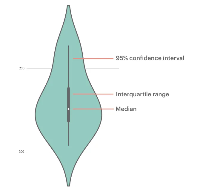
Understanding your data is essential before doing any analysis.
Although df.describe() and df.info() provide basic summaries, they’re limited with large or complex datasets.
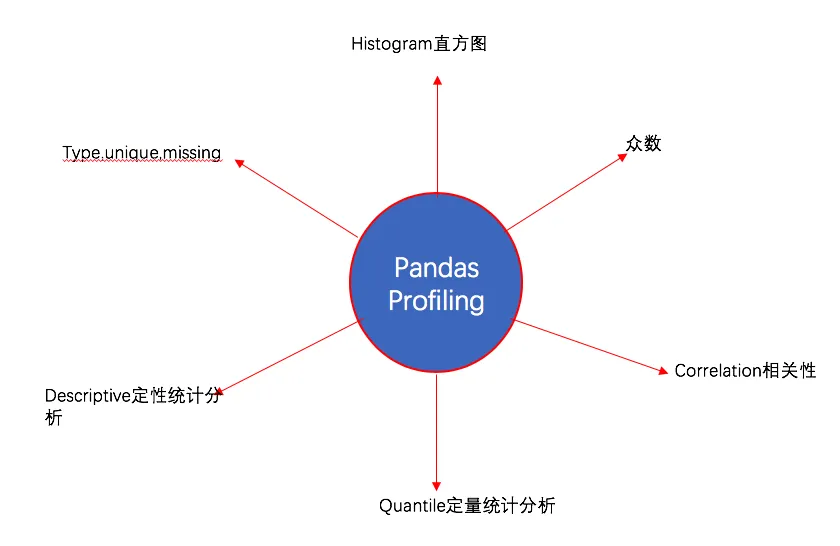
The pandas_profiling library offers detailed profiling through profile_report().

pandas_profile

Installation

pip install pandas-profiling
# or
conda install -c anaconda pandas-profiling

Usage

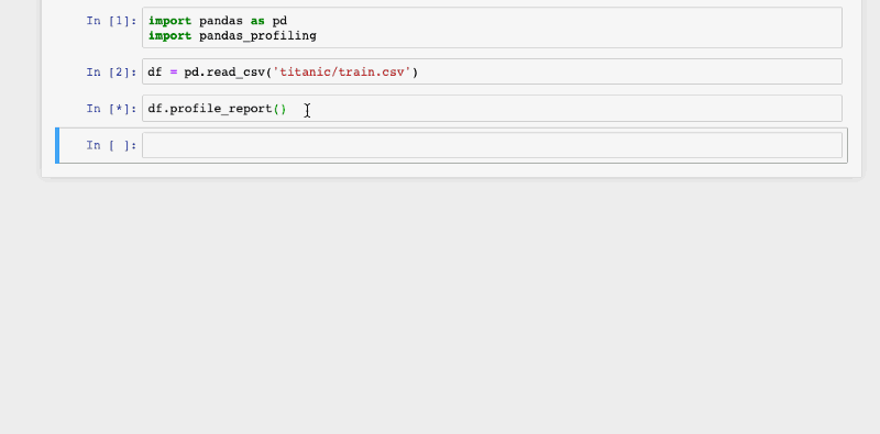
It’s very easy to use:

import pandas as pd
import pandas_profiling

df = pd.read_csv("train.csv")
df.profile_report()

titanic

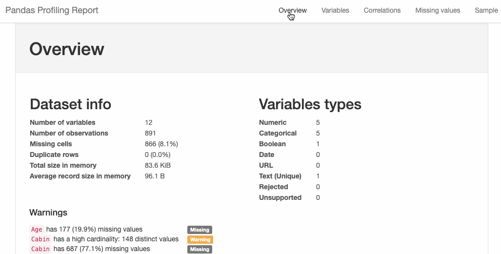
You can also export the report to HTML:

html = df.profile_report(title='Titanic Profiling Report')
html.to_file(outputfile="titanic_Profiling_Report.html")

titanic_html

2. Interactive Plotting with cufflinks

Pandas has built-in plotting via .plot(), but it’s not interactive.
If you want interactivity, try the cufflinks package.

……

阅读全文

Serialization and Deserialization in Python

Sometimes you may need to temporarily store data so that it can be called directly the next time the program runs, or exchanged between different threads. Serialization is a way to store data in this way, and here we explain Python’s serialization and deserialization using the pickle package.……

阅读全文

Drawing a Stunning "Dream of the Red Chamber" Word Cloud with Python 3

Word clouds, which I’m sure you’ve all seen, are created using wordcloud, a famous Python library. This article will detail how to use wordcloud to create a word cloud for “Dream of the Red Chamber,” one of China’s Four Great Classical Novels.


1. Preparation

This involves three parts:

2. The wordcloud and jieba libraries, which can be installed using pip install wordcloud and pip install jieba.

3. Preparing a Chinese font file.

The .txt text file and font file are bundled together for your convenience to replicate this tutorial’s example.


2. Drawing the “Dream of the Red Chamber” Word Cloud

Here’s the code directly:

    from wordcloud import WordCloud
    import jieba
    text = "".join(jieba.cut(open("红楼梦.txt").read()))
    wordcloud = WordCloud(font_path="kaibold.ttf").generate(text)

    # Display the generated image:
    plt.imshow(wordcloud, interpolation='bilinear')
    plt.axis("off")
    plt.margins(x=0, y=0)
    plt.show()

《Drawing a Stunning “Dream of the Red Chamber” Word Cloud with Python 3》

……

阅读全文

Drawing Violin Plots with Seaborn

Introduction

A violin plot is used to display the distribution and probability density of multiple data groups. Similar to a box plot, it offers a better representation of data density. Violin plots are particularly useful when dealing with very large datasets that are difficult to display individually. Python’s Seaborn package makes it very convenient to create violin plots.

Parameters

Drawing Violin Plots with Seaborn

The parameters corresponding to each position in a violin plot are shown above. The middle line represents the box plot data, specifically the 25th, 50th (median), and 75th percentiles. The thin lines indicate the 95% confidence interval.

Drawing Violin Plots with Seaborn

Single Variable Data

While a box plot would suffice for a single variable, a violin plot can certainly be used as well:

    import seaborn as sns
    sns.set(color_codes=True)
    sns.set_style("white")
    df = sns.load_dataset('iris')
    sns.violinplot( y=df["sepal_length"] )

Drawing Violin Plots with Seaborn

……

阅读全文

最近文章

分类

标签

友情链接

其它