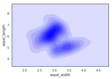
Detailed Examples of Seaborn Plotting Kernel Density Curves
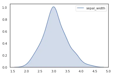
In a frequency distribution histogram, when the sample size is sufficiently enlarged to its limit, and the bin width is infinitely shortened, the step-like broken line in the frequency histogram will evolve into a smooth curve. This curve is called the density distribution curve of the population.
This article walks through how to use Seaborn with the Iris dataset in Pandas to plot several common kinds of kernel density curves.
1. Basic Density Curve
    import seaborn as sns
    import pandas as pd
    sns.set(color_codes=True)
    sns.set_style("white")
    df = pd.read_csv('iris.csv')
    sns.kdeplot(df['sepal_width'])
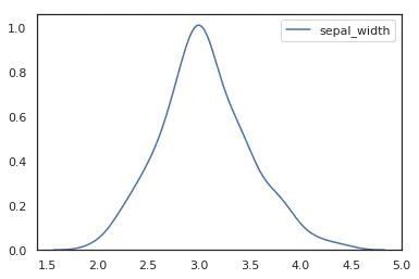
To plot a kernel density curve using Seaborn, you only need to use kdeplot. Note that a density curve only requires one variable; here we choose the sepal_width column.
2. Density Curve with Shading
    import seaborn as sns
    import pandas as pd
    sns.set(color_codes=True)
    sns.set_style("white")
    df = pd.read_csv('iris.csv')
    sns.kdeplot(df['sepal_width'], fill=True)

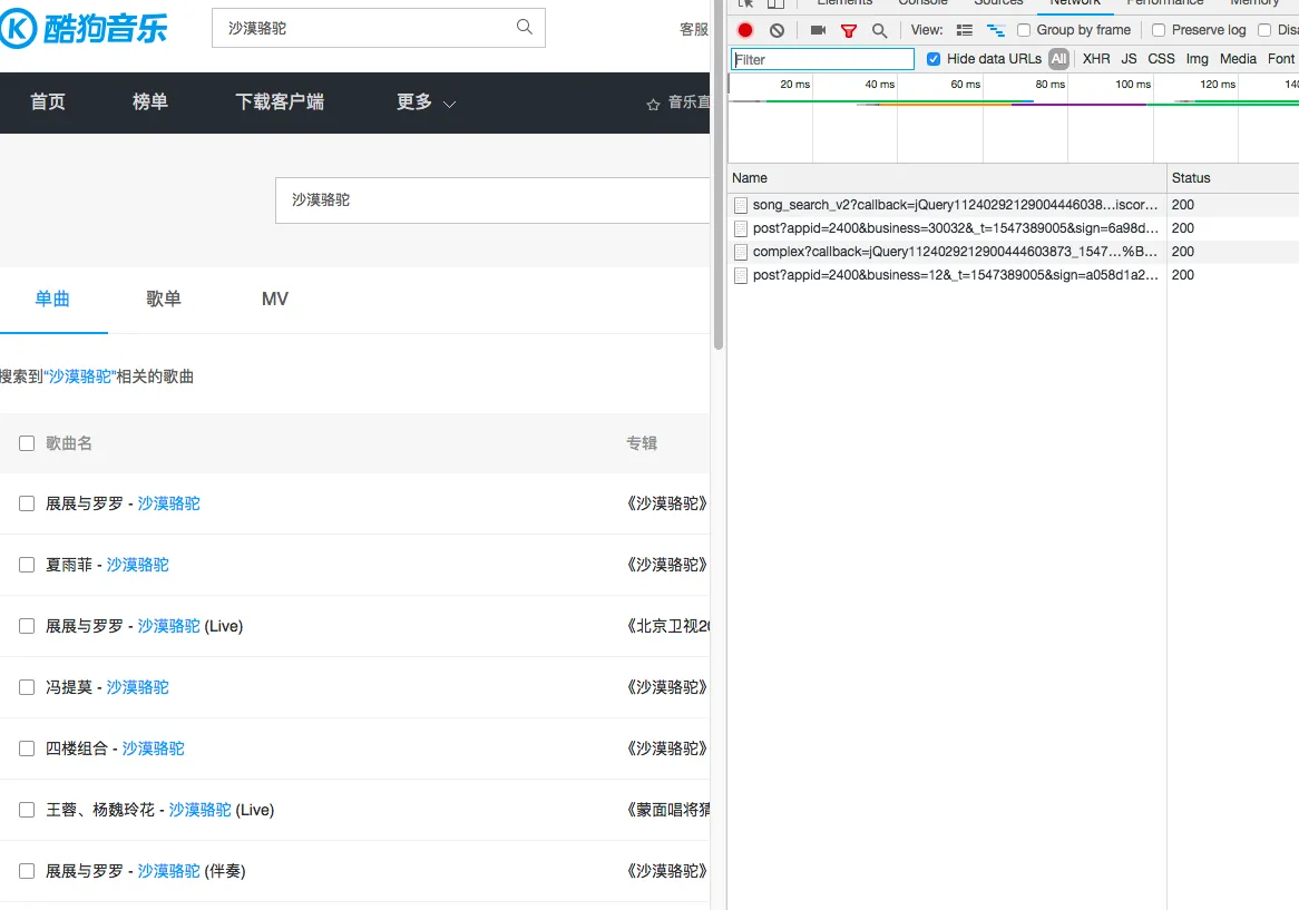 With only 4 network requests, it’s easy to identify that the first request genuinely returns song information, so we can construct this request.