When visualizing data, it’s common to plot multiple charts in a single figure. For example, visualizing the same variable from different perspectives like side-by-side histograms and boxplots for numerical variables is useful.……
When using scrapy to crawl web pages, many websites render content with JavaScript, so directly fetching the source code will not get the needed content. In this case, using selenium to drive a browser to get the rendered content is very suitable.……
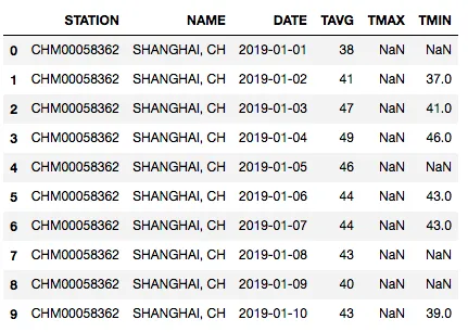
This tutorial shows how to build a random forest regression workflow with Python and sklearn using Shanghai weather data, covering setup, cleaning, feature engineering, training, evaluation, and prediction.……
This article summarizes the 6 most useful Python string splitting methods, including split, rsplit, splitlines, partition, rpartition, and re.split, with practical examples and usage notes.……
This article shows how to inspect Aliyun’s domain-reserve requests with Python and automatically collect candidate lists of recently expired .com domains for later manual review and registration.……
This article explains what logic is, how categorical syllogisms work, and how to quickly spot common logical fallacies such as ad hominem, circular reasoning, straw man arguments, and hasty generalization.……
This guide explains how to solve LeetCode 468 in Python by combining the ipaddress module with the stricter problem-specific rules for IPv4 and IPv6.……
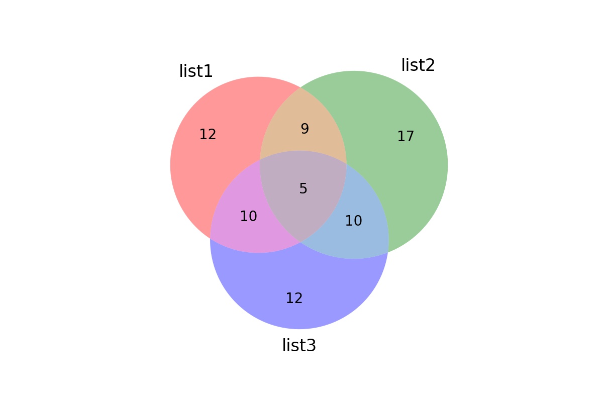
In Venn diagrams of two sets, there can be two (or more) overlapping circles representing sets of different sizes, but the circles are the same size. Actually, the circles should be proportional to the size of the sets, and the overlapping area should also be proportional to the data overlap.……
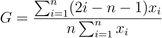
The Gini coefficient and Lorenz curve are widely used to represent data inequality, especially wealth inequality. However, currently in Python, there isn’t a very good function to directly plot the Lorenz curve. Since the current project requires it, this article records how to use numpy, pandas, matplotlib, and other packages to calculate the Gini coefficient and plot the Lorenz curve for practical use.……
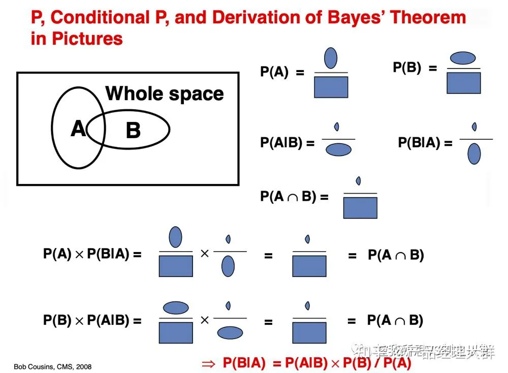
Bayesian theory provides a principled method for calculating conditional probabilities. With it, we can easily compute conditional probabilities for events where intuition often fails.……